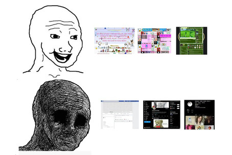
The rise and fall of web profile customization
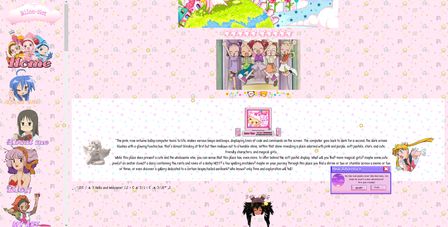
If you were to browse the Internet in its early days, you will encounter it very different from what it is today. Several websites would offer the possibility to customize parts of your own profile, allowing you to express yourself in the way you wanted and be creative in your personal web space.
But that is now a shadow of the past: Standardization and a “more corporate look” are seemingly now the norm. But why is this? I will explain it in depth in this post.
In short, there are several reasons why the Internet began its transition to what it is now, and despite what many people may think, the big player is not actually because of “corporate greed”.
How customization is achieved in the first place
| |
|
Before we can begin outlining the reasons, we need to understand how making the look of a webpage is achieved in the first place.
Back when the World Wide Web started taking its first steps, we already had one of its corner stones already settled: HTML, a markup language that allowed your browser to display content from the web in a rather standardized way. This allowed you to create simple layouts for your pages, and a bit later, allowed you to make certain customizations such as changing the text color or the background images.
Customization would evolve to the next level with the introduction of CSS, which allowed to further customize HTML elements, their layout, and eventually, even make custom cursors and animations.
But these would remain static pages with no changes whatsoever, unless you used PHP or something similar to generate personalized HTML on demand, and even still, it wouldn’t be interactive apart from links to other pages. But during the 2000s, JavaScript eventually came into play to provide interactivity to websites by modifying the HTML and CSS of a page.
| The conjunction of all of these technologies was given the name of Dynamic HTML (DHTML), and it was somewhat feared by novice developers because in the early days browsers had their own ways of implementing JavaScript and CSS. Nowadays websites are pretty much expected to have HTML, CSS and JavaScript, and all of these have become standardized for the most part, so the DHTML term has fallen out of use. | ||
| |

By adding the possibility to add your own HTML, CSS and JavaScript, you could essentially change the style and outlook of the page, especially with the latter two.
Custom scripting is dangerous
Very early on, one of the first restrictions that were put in place when adding customization capabilities is the automatic removal of <script> HTML tags. These tags are the main way for you to place JavaScript code on a page —and depending on the point in time, you could use some other scripting languages too— in your page.
There’s a whole plethora of vulnerabilities that revolve around tricking the servers into injecting your own code, because any opportunity of doing this opens floodgates for malicious code to be run. When you can just outright add your own scripts because the tag is not filtered out, there’s nothing stopping you from putting in malicious code to do some treachery on your visitors, so it’s like having no floodgates at all.
At first, MySpace didn’t have this restriction when they accidentally added the ability for you to add your custom HTML. While most pages would be really creatively put together, some of them could be crafted with harmful code to say, install a virus or wreck havoc on your screen.
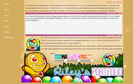
<script> tags. Thankfully CSS was able to give you some slack, because you could add some “interactivity” with pseudo-classes such as :hover and :active, so you didn’t need JavaScript to make interactive UI. In fact, The Yonic Corner remains somewhat interactive even with JavaScript disabled.
The rise of responsive layouts
The main limitation that HTML had in its starting days was the fact that it was very rigid. It would look the same no matter how the size of the browser window was. This created a problem in which content would spill over the window if it was small enough, requiring you to scroll the window. This was okay for vertical scrolling, but horizontal scrolling was more obnoxious.
At first, it wasn’t much of a problem because the web was mostly browsed from a computer screen, and they had roughly the same size, aspect ratio and pixel density, so screen resolutions were mostly the same. However, it was still relevant enough that some websites would display messages like “looks best on a 1024 x 768 resolution”.
It became a more notorious problem once phones became capable of browsing the web, and especially with the rise of smartphones, since they would have way more different aspect ratios, display sizes and eventually even pixel densities.
| Thank you, Apple. Your Retina display started all this. | ||
| |

This led to the creation of solutions to create responsive layouts. CSS first started with @media queries that allowed different layouts depending on the screen size. Later on, intrinsically flexible layouts would become much easier and way better to make with CSS’s flexbox and grids, among other things, which would become quintessential to make layouts that could work at any resolution.
However, because these CSS features are a late addition, this is not the default behavior of HTML. This was done in order to maintain backwards compatibility with older websites. If the user who wanted to customize something was not aware of the responsive layouts, whatever layout they would create would most likely be not flexible by default, so if one were to add their own HTML and CSS, they could very easily be set in a way that would either conflict with, or completely break the already set up layout.
This caused websites to begin following a “mobile-first” approach to their design, one that would be friendly to smartphones at first, and then gracefully change the layout as the viewport of the browser got wider. Standardizing the layout severely limited the way one could add, move, replace and remove HTML elements.
Scalability issues
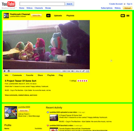
Although this was a smaller issue, it’s still relevant to this day. All of these customizations had to be stored somewhere and loaded in apart from the core website’s design. Depending on the infrastructure, this could make pages prone to undesirable effects such as flashes of unstyled content, where layouts will break, everything is on a white background and the text is black with an ugly serif font.
Images were also a big problem. They usually were hosted on an image hosting service such as ImageShack and were usually left unprocessed. If they were large, they could severely affect the bandwidth and cause loading issues. Also, most image hosting services would remove the images if not accessed after some time, leading to broken images if they were not used a lot.

Nowadays images are preprocessed to modern, more lightweight formats and optimized, and cached so that the load isn’t as heavy. While this in itself makes no limitations on what kind of images can you use, they do have their own shortcomings that limit the number of how many images can you upload.
The rise of web apps
| |
|
Since Flash and HTML5, websites have become way more interactive than ever, and with that, browsers have become the second most versatile pieces of software apart from a full fledged operating system.
This has given browsers the potential to run websites as if they were real applications, which developers found very attractive thanks to the fact that websites could be displayed anywhere, regardless of the operating system or device you were using.
The culmination of such process became true with the rollout of Progressive Web Apps, which allowed websites to behave much like a native application on your PC or phone. You could also throw in UI frameworks for highly interactive user interfaces that would make your website come close to the performance of a native app.
But this clashed with customization in two ways:
- If you added custom HTML and CSS, it would most likely be unable to interact with whatever reactive components you had with your UI framework unless the web developer added a functionality for that, which comes at the hefty cost of being way less secure.
- Apps generally have a UI that is mostly consistent with a design idea and tries to provide a good user experience; allowing for custom CSS to change this could alter these in a harmful way.
It also didn’t help that at this time accessibility guidelines were starting to be set in place, which discouraged taking certain “creative approaches”.
CSS libraries would also begin showing up, first with Bootstrap, and later on with Tailwind CSS, that helped making websites look and act like apps, albeit with the cost of having to remain somewhat consistent.
Addressing the ads problem
Lastly, let’s discuss the elephant in the room: Why do people say that advertisers prefer a more “corporate” looking website?
One of the common remarks is that having a set layout allows advertisers to get a good idea where their ads will go, how much space will it take, etc. And yes, that is a valid point. One can easily hide away them with CSS or disable altogether with JavaScript, like this:
 |
|  | ||
 |  |
 |
|  | ||
 |  |
| This is basically what ad blockers do, by the way! | ||
| |

This is the most straightforward way, although there are more creative ways to hide them. But alas, this isn’t the main reason. There is no such thing about websites becoming more “corporate”. It’s a bit of a misnomer.
What’s actually happening is standardization of a design language. Now we treat parts of a page with common lingo such as “hero”, “call to action”, “statistics” or “feature”. Now it’s all about consistency, which is something that’s typical from an application: You want its features and user interface to behave in a consistent manner.
On July 2024, of the top 25 most visited sites (source: Similarweb), 15 of them are web apps. This goes to show how important consistency has become in the past few years. Google’s search engine also tends to favor sites with a consistent semantic design (the HTML has all of that lingo mentioned above), so everyone tends to follow very similar design patterns because of search engine optimization (SEO).
But that doesn’t mean you can still be artsy! However, it’s a fact that your SEO will get harmed this way because these designs tend to be more “niche” and “out of the norm”.
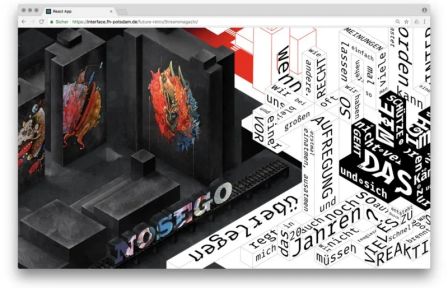

But if there’s one thing that’s become obvious is that we’re far from that moment where the Web was still figuring itself out. Companies would do their best to fit their branding on the web, while there was still room for customization. As Internet became a new way to do commerce, consistency became more important than the flexibility of customization, and since they go hand in hand, the overall branding favored over the individual expression.
I can understand how these phenomena can be confused with “corporate greed”. But in an objective sense, I do think the pros of lack of customization outweigh the cons, especially in times where new web features come and go really quickly. While people tend to follow standards even if you do provide customization, not everyone does, and those intrusive designs can hinder your experience on a website.
And yes, I also understand that this also hampers freedom of self-expression. Tumblr was probably the best example of all time in terms of web customization: Restricted yet flexible enough to do almost whatever you wanted. But I’m a hard advocate that freedom of expression should end where the freedom of someone else begins, something that the current Internet doesn’t seem to understand. Be mindful of what you’re making!
But nevertheless, I still wish for customization to make somewhat of a graceful return. It’s cool that graphic and web designers can have their own way of self-expression for their portfolios and all, but I also would love to see the resurging of being able to do it in a more casual basis.

