Making The Yonic Corner Legacy: The layout
| |
|
Whoa, it’s been nearly a year since I promised part two of how I made the Legacy version of The Yonic Corner! The thing is, I wanted to complete the majority of the features of the version in order to fully cover the whole story.
And now that it’s finally feature complete, here’s the long awaited second part!
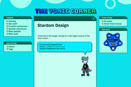
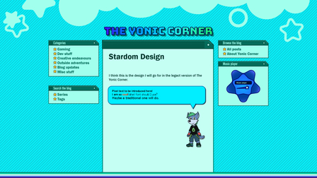
In part 1, I discussed about what visual style I wanted to use for the Legacy version of this blog. This part goes through the technicalities of making the design a reality.
Selecting the supported versions
This was a simple yet very hard choice to make. Ideally, I wanted to support as many operating systems as possible, but I knew this would be a very difficult task.
At the very least, I wanted to support the Windows 9x family of OSes, which meant that Internet Explorer 5 would probably be my target browser. The main problem with that it’s that IE5 came out at the very beginning of the standardization of the web. Which meant that whatever worked on this version would probably break in older versions. I ended up settling on IE5.5, which comes with Windows 98 Second Edition, and hopefully port to IE5. Of course, I also wanted to support other browsers from that epoch such as Mozilla and Opera —the latter of which is used quite often by retro web users.
Another motivator for supporting Internet Explorer 5 was that there was a version specifically made for some UNIX operating systems. But after researching on how to install the browser on Solaris, I quickly gave up because of the lack of expertise I had on Solaris to install it properly without resulting in system failures. To my knowledge, there is no script to do this automatically. I still have to figure out what to do about adding support to UNIX/Linux operating systems, as there were many distros with their own browsers. Konqueror and Galeon seem to come to mind, but there may be others that were used more (excluding Firefox).
I was also interested in supporting Mac Classic, which I have rarely used, but after not much research I quickly settled with Mac OS 9. I’m pretty sure Mac OS 8 also works, but version 9 was what I could get a hold of. I settled with Classilla as the target browser for this OS, but with how deeply disappointing and similar it seemed to be compared to Netscape 7 in functionalities, I also threw in the latter browser as one of my potential targets. Internet Explorer for Mac was a tempting possibility, but it was prone to crashing the Mac emulator I was using, so I set it aside for the time being.
Then there was Flash Player. If I wanted the music player in the Legacy blog while remaining cross platform, this was the only way to do so. Internet Explorer has a way to embed audio to a page, but it was non-standard and quickly deprecated in favor of HTML5 audio. Supporting Windows 95 and NT 4.0 meant that I had to stick with version 7 and ActionScript 2.0. I didn’t know it at the time, but this would be the source of a lot of headaches later on.
Understanding the fundamentals, once again
The Yonic Corner Legacy Version targets browsers that came about at a time where the W3C was just about 5 years old. To understand what that meant, we need to go back to that time, when Internet just started catering home consumers in the United States.
In the early 1990s, the World Wide Web was a wild place: Everyone had their own way of displaying websites and doing things in them. Even if standards for communicating such as hypertext and its transfer protocol (HTTP) were being used, those standards weren’t yet fully completed. One of the most notable examples was JScript: Microsoft’s implementation of JavaScript for Internet Explorer, which, in an effort to gain influence over its competitors, added features that were totally incompatible with other browsers, a development stunt that was infamously named “Embrace, Extend, Extinguish”.
| In fact, you could use other script languages in Internet Explorer. The For the longest time, JavaScript became the only way to use client-side scripting on the web, so the What’s really nice about this is that browsers that don’t support ES Modules (or any specified language for that matter) will safely disregard any script tag with | ||
| |

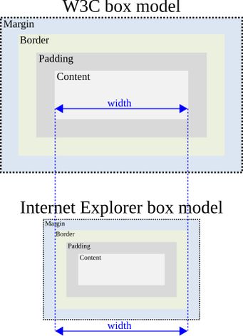
This is how I got introduced to the infamous Internet Explorer box model bug. The box model in HTML is a W3C specification which defines that every HTML element can be represented as rectangular boxes, which can have content, padding around that content, a surrounding border at the edges, and margins to separate elements around. In CSS, you can control the overall sizing of the element with the width property, and the “bug” is caused by how Internet Explorer (and also Netscape, by the way) determined how to compute that width.

width of an element as the sum of the widths of the content, its padding and border thickness to the left and right sides of the box. However, the W3C standard computed it to be only the content without the paddings and borders. This meant that Internet Explorer and Netscape rendered the elements smaller than they should’ve been according to W3C. And here’s where my rant against W3C begins: The thing is, the W3C was wrong. When Internet Explorer 6 came out, many layouts potentially broke all over the web. The reason? IE6 switched to the W3C box model.
Take a look at this CSS code:
 |  | |
 |  |
In versions of Internet Explorer before 6, the actual width of the element would be set to 600 pixels, and other elements would be laid out considering that size. But in IE6 onward, the content box is set to 600 pixels, and the padding and border are added afterwards; resulting in a width that would actually be 624 pixels! This may not be what the web designers intended in the first place. In order to truly make it 600 pixels wide, you’d have to subtract the extra 24 pixels to the width property.
The worst side effect that this had was that this change made flexible layouts almost impossible to make:
 |  | |
 |  |
When setting width to a percentage, it takes on the percentage of the content width of the parent container, so regardless of the box model, a percentage width less than 100% will keep it nicely tucked inside the container. But this breaks when you introduce padding or borders, because the W3C model will grow the two element beyond that width; if it’s set to a 100% with either a border or a padding, it will always overflow its container. Meanwhile, the traditional model keeps the correct size and no overflows occur! And what’s worse, the only way to fix this with CSS alone is with the calc() function, something that Internet Explorer did not support until version 9, which was already too late for reasons I will discuss later.
Thankfully Microsoft saw through this problem and introduced a concept called quirks mode. By using the DOCTYPE special tag at the beginning of the HTML document, you could instruct Internet Explorer to render the page in either standards mode, which would attain to the W3C box model; or quirks mode, which maintains backwards compatibility with Internet Explorer 5 and older. Other browsers would quickly follow suit with this behavior, and eventually became a standard across nearly all HTML versions. I won’t go into detail about which settings for DOCTYPE triggers which mode according to each browser, but this Wikipedia article has a nice table with some possible combinations.
Unfortunately for me, however, Astro always generates pages with the DOCTYPE that suits HTML5 documents, forcing the browser to use standards mode or almost standards mode, meaning that I would have to deal with the layout issues introduced by W3C standards.
| Although Astro later introduced a way to render Astro pages on demand, allowing me to hack my way through that behavior, that feature was introduced way after I finished the layout. I don’t have any motivations for going through the hard work of trying to hack my way to have quirks mode enabled and make sure it works with all browsers again. The only one I can think of would be adding support for Internet Explorer 4. But that’s a huuuge “if”. Besides, quirks mode also triggers some other non-standard behaviors; the box model is just one of the more notorious —and nagging— ones. | ||
| |

People would later realize that the new standard behavior by the W3C was prone to many problems, so in 2006, Mozilla introduced the box-sizing property, which controls what should count as the width of an element.
By setting it like this in CSS, you could sort of opt back in to the old behavior from quirks mode while remaining in standards mode:
 |  | |
 |  |
This new property was so well received that even the W3C would end up capitulating and turn this property into a standard. I might be wrong on this, but we take the code above for granted so much that now it might be something that many web designers teach very nonchalantly: “Don’t forget to put this, it’ll make things work properly.” or something of the sort, without actually understanding the reason behind it.
But this is of no use to me! Remember, this was introduced in the mid-to-late 2000s and didn’t become a standard until several years later, and Internet Explorer only began supporting this with version 8. Like I said before, it was all too late. So with no other options, I’d have to deal with the quirks of the standard rendering mode.
Getting to work
Now that I was somewhat familiar with the basics, my first step was to create potentially suitable designs.


Knowing that responsive 3-column layout was probably not going to be feasible, I went with a static, table based layout; an old-fashioned technique, but I am making a site for old browsers, right?
My game plan was to first cater the quirky browsers, and then apply CSS patches that would work for browsers that follow the standards. Normally, one would focus on the standard browsers and then patch up the quirks from older browsers, but I found this process to be much simpler the other way around. Although later on I would add specific patches for browsers that have a very quirky behavior and I don’t see any other way to fix it without compromising the other browsers’ stability.
Internet Explorer also has an incredibly handy feature to selectively apply patches across most of its versions (5 through 9) through conditional comments:
 |  | |
 |  |
Since most other browsers would play by the standards, I needed the standard CSS patches to be available for them as well, and this code above will certainly do the trick.
I also had the power of modern enhancements to CSS thanks to both SASS and, later on, PostCSS, to convert modern features such as calc() into hardcoded supported values by these browsers.
Slowly the elements of the website would carefully be integrated, one by one. Some were trivially easy to make. Others, not so much. 9-slice elements such as the text bubbles and the code windows were very painstakingly crafted with tables, but I think I may have put the browsers to their limit when developing these, because they seem to have some transient issues when displaying them sometimes. In situations which CSS couldn’t cover some of the edge cases, I could rely on jQuery as a last resort.
Once I finished porting the majority of the post components from the Modern version —and showing a warning for those that couldn’t be ported due to web limitations— I ended up with two different versions of the blog, even though the data and posts were mostly the same. Although not an easy conundrum, I was able to merge the data of both versions together, so that I only need to write a post in one place, and both the Modern and Legacy versions could fetch and display the new post on their own.
All in all, I’ve learnt quite a lot about some of the most obscure elements of CSS and HTML, and particularly even more quirks related to each browser and operating system, and despite the many, many, shortcomings and problems, I had a lot of fun making the Legacy Version of The Yonic Corner.
Here’s a list of some of the things I’ve learnt:
- You can adjust the position of the marker of lists with
list-style-position. - HTML4 properties have fallbacks in modern browsers using CSS, at least for the most part.
- Now I fully understand the concept of web safe colors, as not only they could change drastically in screens with limited color depth, but they also can have flashes of colors when switching between applications —a quirk of the process graphics cards and software do called “palette realization”.
- Despite not supporting it, jQuery does work on IE5.5. Although only like the very first handful of releases, and only a very limited set of functions, but it was still good enough to do the things I wanted it to do.
- Tables have two ways of being rendered depending on how you set the property
table-layout:fixedandauto. I still don’t get how they work exactly, butautoseems to be the option that can come closest to a flexbox —although it’s also the most unpredictable and the most prone to layout breakdowns. - Although all of my target browsers support PNG, the vast majority has only 1-bit transparency support (such as with PNG8), so they can only be either totally opaque or totally transparent. The only one that does seem to have a more robust support for partial transparency is IE5 for Mac… *sigh*.
- When an element overflows in IE5, it actually makes its container bigger than it should be, instead of the element just popping off the container.
- Flash Player 7 sucks. But that’s a story for another time.
I’ve also came up with a really elegant hack for overcoming the problem regarding elements getting wider with padding. The key is that the enlargement only happens when you’re setting a padding or a border to an element with an explicit size. But if the size remains intrinsic —that is to say, it takes on its natural sizing— it will behave like in quirks mode or border-box sizing.
By default, block elements such as div will take all the available horizontal space. So why not use one intrinsically sized container as a padding box for the content?
 |
|  | ||
 |  |
 |
|  | ||
 |  |
Set the width of the container-class elements to percentages and you could potentially have something like a rudimentary responsive element!
But I’ve learnt one more thing about the box model, which is the kicker. All the time I’ve mentioned the box model, I’ve been talking about the width of an element. But what about the height? It turns out that the height of an element is computed in an entirely different way, and there is no mention of padding nor border in height calculation. And older browsers seem to calculate it in the same way regardless of the rendering mode! So, unless you set the box-sizing: border-box rule in CSS, padding and borders will always make the element taller than specified.
| Alright, I can see this not being as much of a deal as with The horizontal axis being more sensitive to the vertical one is sort of a valid reason not to care. But in a world where fullscreen web apps exist, that’s still going to be the source of problems if you don’t know about that behavior! And also the padding and container hack I just mentioned would not work with heights! Seriously! Whose minds came up with this crappy design!? Did they think web elements should behave like files because of the “padding”? | ||
| |

I think the last part of this series is going to be the most fun one. I want to address and laugh —and roar in anger— at the many issues and weird stuff that happened since I started working on this project. Hopefully it won’t take a year to post it!

