Making The Yonic Corner Legacy: The design
| |
|
With the motivation set to create a version of my blog for old browsers, I had to come up with a design and basic goals, as well as figuring out the shortcomings of these browsers.
I already figured out that my ideal goal would be to be able to browse the web using technology from the late 1990s (namely, Windows 9x and optionally Classic Mac OS), so all that remained was to come up with a design and put it into practice.
Getting inspired
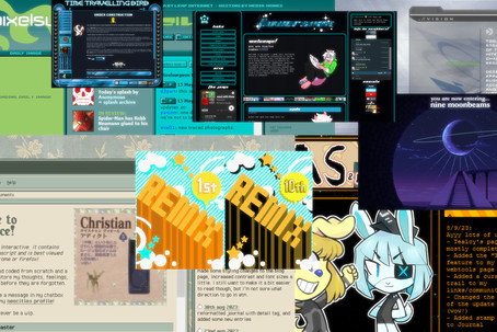
First off, I needed to get a good idea of what I wanted to make, so I went through the path that searching through old web designs took to find inspiration once again. I already had sort of an idea of what to do, but I needed specifics.
So I went through several websites throughout the years in the Wayback Machine, and even used The Old HTTP Proxy to quickly browse through them. This allowed me to check the source code and HTML contents of a page without much of a headache of dealing with the iframes the Wayback Machine introduces.
| I even checked my very first website! Sadly, virtually none of the assets got archived and it was mostly text based, so it didn’t give me much to work on. There were older versions with more interesting layouts, but I think those never got archived. | ||
| |

When I first found about Neocities and checked the CMS used there, I had some expectations about being able to check the HTML inside as well. But several of these user-created sites were hiding HTML5 components and flexible or pseudo-flexible layouts. At least responsiveness wasn’t much an order of business on these sites.
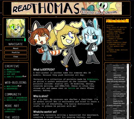
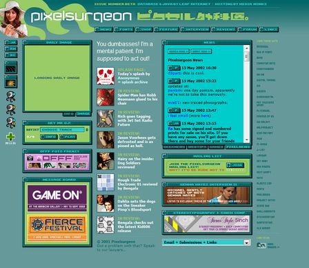
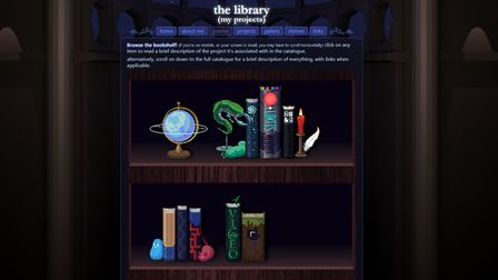
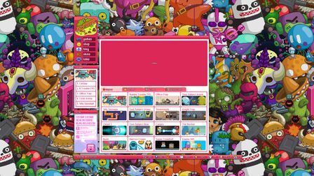
Here are a couple of the sites I’ve found the most interesting and influential in my design:


Assuming possible limitations
Since we are dealing with browsers over 25 years old, it’s essential to understand what was possible to do at the time, and what technologies were not yet established.
One of the seemingly more daunting issues was that HTML5 wouldn’t be a thing until the late 2000s and that there was no way for Astro to generate pages other than HTML5 out of the box.
But it turns out that this isn’t much of a big deal!
Old browsers can still render documents that by modern standards would be in HTML5, and many still retain backwards compatible with deprecated HTML4.1 elements like <marquee>.
| So long as I remain exclusive to HTML4.1 elements, documents will usually be rendered just fine in standards or almost standards mode, depending on the browser. This will become very important later on! | ||
| |

Back in the day, instead of playing audio with HTML5, pretty much most sites leveraged the power of Flash Player to achieve this. I already had experience with this undead beast many years ago, so it was time to unearth it from the ground. After a short research, I noticed that while Windows 98 supported Flash Player 9 (which introduced ActionScript 3.0), Windows 95 and Mac OS Classic supported only up to Flash Player 7.
This meant that either I would be forced to support the music player only for Windows 98, or I would have to develop it with ActionScript 2.0, which I haven’t had touched in more than 10 years and was significantly less capable of drawing advanced graphical effects. At the time of writing this post, I have still remained undecided on what to do.
So I decided to set that aside, and focus on what was probably the biggest issue: The layout. Since I tackled this while making a prototype for it, I think I’ll leave this for the next part of this series, coming up very soon!

