I'm finally quitting YouTube, and it's all great
| |
|
There’s no denying that YouTube has become increasingly addictive over the last decade, and in the past few years I’ve begun to become increasingly more distasteful of the platform as it becomes more and more harmful to my wellbeing and my lifestyle.
However, recent changes in their platform and its “algorithmic shifts” have pulled my last straw, and have forced me to finally take definitive actions.
The reasons why YouTube sucks
Since the mid 2010s, YouTube has been developing some UX design practices that in my humble opinion, are anti-humanistic in that they are designed to drain your soul away for profit. I’m not exaggerating on this.
Social engineers have researched the concept of “attention economy”, the business model of keeping the attention of a user in order to throw the user as many ads and collect as much usage metrics and marketing data as possible.
To achieve this, YouTube relies on several UI and UX patterns that rely on stimulating the user’s attention with minimal input —especially on mobile, which is more convenient for the user:
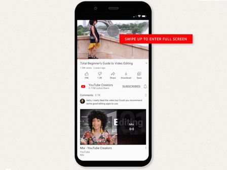
- In the home screen, you get a list of recommended videos that are likely to grab your attention.
- If not, the user swipes downward to “pull” the UI. This is actually very similar to pulling a lever in a slot machine.
- Because the content shown is user generated, what will be shown is random, with a bias to cater the user. This is very much like a Skinner Box, which helps encourage people into repeating the same action over and over again.
- Autoplay is enabled by default, which negates the necessity of looking for a new video after finishing with another.
- When the user selects a video, a list of recommendations appears below the video. This creates an escape route from a dissatisfying video to something that may be more pleasing to the user.
| The thumbnails of these recommended videos used to be much smaller, and in even older versions, you had to check another tab to see them. Nowadays they are just a tad smaller than the video when in portrait mode and visible as soon as you open the video, which makes it an extremely more convenient “escape route”. 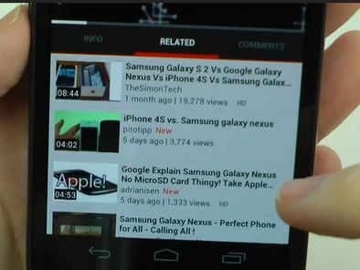 | ||
| |

This is all done to ensure one can enjoy videos with as minimum hassle as possible. This may seem like it’s not a big deal, but in a world where the principle of minimum effort reigns, it is vital for user engagement.
Why? There are many factors, but one of them is because our brains are very conscious on the effort you put to obtain something, even if it’s something as small as pushing a button. A research paper makes a direct inverse correlation between the lack of effort and the probability of choosing what content to watch, and that the balance between how worth the effort is for the reward works at a logarithmic scale: It makes a much bigger difference between 1 and 2 steps than between 10 and 11.
TikTok has managed to basically reduce this to essentially zero from the point you open the app, basically turning it into an “automatic fast video feeder”. YouTube is betting hard on this too with YouTube Shorts.
Yes, the speed at which new content is delivered can also trick your brain into wanting more even though the content you might be watching isn’t that interesting. This study links this phenomenon to attachment theory —one involving forming interpersonal connections, especially with parents. In other words, researchers hypothesize our brains can think of YouTube and TikTok as if it were loved ones.
| | The Legacy Version does not support playing YouTube videos. You can check the modern version of The Yonic Corner, or open this video from Insidious.Both options require a modern browser. |
This results in the paradoxical effect that people now don’t really need highly enjoyable content to stay engaged, because instead of selecting what you want to watch, the content is given to you directly without any input from you. This has led to an oversupply of videos, both of high and low values of production, but with very varying quality of engagement. This “era of excess” —as some experts call it— is usually described as YouTube giving you feelings of boredom, fear of missing out, anxiety, depression, and loneliness.
All of these gimmicks (among many, many other factors) result in the many negative effects that have been deeply documented by many studies across the years, like the ones above. I suggest looking them up in Google Scholar if you don’t mind the scientific jargon, because press (especially on TV) tends to hit hard on these by blowing the effects a bit out of proportion to discourage people from using competing mediums of entertainment.
So what did I use to do to combat this?
Basically, I simply did the opposite: Make the experience of browsing YouTube as painful as possible, but not too much, so that I could still enjoy it without feeling like I’ve been drained of my time.
I use Unhook, a browser addon to remove some of the most convenient ways to watch videos. After installing it, if I wanted to watch a video, I had to actively type it in in the search bar, an extremely effortful thing compared to being suggested what I wanted to see.
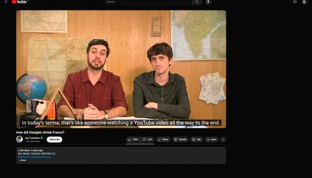
Since then, my experience with YouTube has improved massively. All of a sudden, I was way more invested into watching longer videos all the way to the end —an impressive level of commitment according to Map Men. And if I don’t know what else to watch, I began getting the sensation of needing to stop watching YouTube, and now I only watch it the time I absolutely need to, most of the time anyway.
However, this is only when I use YouTube on PC. On mobile, I have no way to customize this with as much freedom that I know of, and I still end up using it a lot more than I should. There was the risk of misclicking on the app and being forced to watch a short until I figured out how to get away from them, but it was pretty miniscule in comparison to the rest of the time I spent using the app.
| And even in the remote case I wanted to share a YouTube short to someone else, I’m able to convert the link to those shorts so that you can watch it as a regular YouTube video. Like this! youtube.com/shorts/id-of-video → youtube.com/watch/id-of-video | ||
| |

But it was fine for me at the time, as I was just starting my screen time diet. I wanted to take thinks slowly. But all of a sudden, YouTube would change in a way that I just simply couldn’t tolerate and made me take more drastic measures.
The last straw
YouTube’s latest change is what has ultimately forced my hand into quitting YouTube altogether: The war on ad blockers.
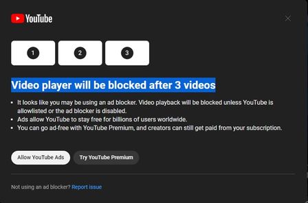
| I haven’t really seen this message myself but I still find it outrageous. | ||
| |
| I think I have, once. | ||
| |
 |  |
Advertisements have been part of the YouTube’s business model for a bit over a decade, but over the past few years ads have started to become more and more intrusive to the viewer’s experience.
Over its history, YouTube went from ads to the side of the video, to small popups at the bottom, to midroll advertisements that used to be skippable after 5 or so seconds —which I can assume everyone did. Now you can’t even skip those ads (although bypassing them was possible for a while) and you can expect at least one every two videos or so. Sometimes, two in a row.
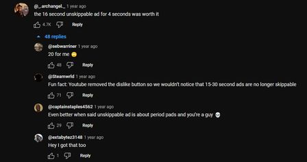
Granted, I have to admit that the attitude towards advertisements has gone pretty sour over the past few decades, because we were pretty used to ad breaks with television. However, they were —usually— pretty seamless because they usually had transitions to ease the way to them. Nowadays, not so much.
YouTube used to put ads to the side of a video or relatively small at the bottom side over it, but nowadays it’s a video ad that creators have barely any control over its placement and can result in very awkward and annoying cuts, so regardless of whether their actions deserve their hate or not, they’re kinda asking for it. At least they are merciful enough not to put these kinds of ads in developing countries…
If it were a more seamless experience, I wouldn’t feel the necessity to use an ad blocker. But huzzah —many websites and apps already clutter their content with so many ads that it significantly hampers my experience. As long as that remains true, I’m keeping my ad blockers on.
The turn to Invidious
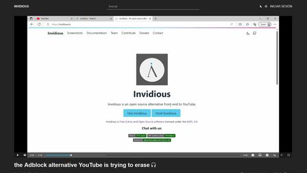
Now I consume most YouTube content through Invidious. But I didn’t realize that this change would also bring along some unexpected but positive effects that helped me a lot on my PC Exodus —that’s how I call the screen time diet initiative I’m taking— because the experience I have with it had the perfect amount of misery I needed to take several steps forward on reducing my screen time.
Invidious is a frontend that is installed in servers across the world called instances, and serves as a some sort of an ad-free and privacy-respecting alternative to YouTube. Of course, Google is actively fighting against it by blocking access to YouTube videos from these instances. However, it’s not perfect and Invidious hosts work hard on bypassing those blocks. On times where the block seems to persist, I just quit and stop watching videos.
But by far the most significant improvement was on mobile. The usage limit function on iOS tends to have a pretty annoying issue when using it on “installed web apps” like, say, an Invidious instance: The website doesn’t respond to any input after choosing to “ignore the time limit warning”, and very often I’m forced to restart the app and search the video again. In Safari and websites added to the home screen, the time expired screen shows up every time you enter a new domain, so this will happen every time I switch instances, making it a huge pain to watch videos when I surpass the time limit and the instance has been blocked.
Ever since I replaced YouTube for Invidious on iOS, my usage time has taken quite the drop, and for the first time, I reached under 3 hours a day in weekly usage. A huge accomplishment!
I’ve also noticed that my productivity time has increased quite significantly, and I’ve been able to clear my backlog of games at a quicker pace than before, but my overall satisfaction has remained mostly the same, if not better!
In the near future, I will be willing to take much bolder steps.

